Energy Intelligence
Designing a mobile-first energy management platform for facility managers and technicians who spend most of their time on the go — turning real-time building data into fast, confident decisions, anywhere.
Overview
Putting energy data in the field
"Frank" (the facility manager) and "Tom" (the technician) spend 25–75% of their time on the go. They need to be notified of valuable energy and operational opportunities at their buildings, and manage measure implementation from wherever they are. Customers want real-time visibility, aggregations, and comparisons of their data.
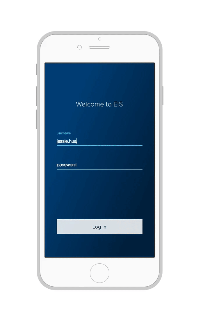
To provide a starting point for rapid iteration and prioritized learning, we set out to design an EIS (Energy Intelligence Software) app MVP — starting mobile-first, then expanding to the web.
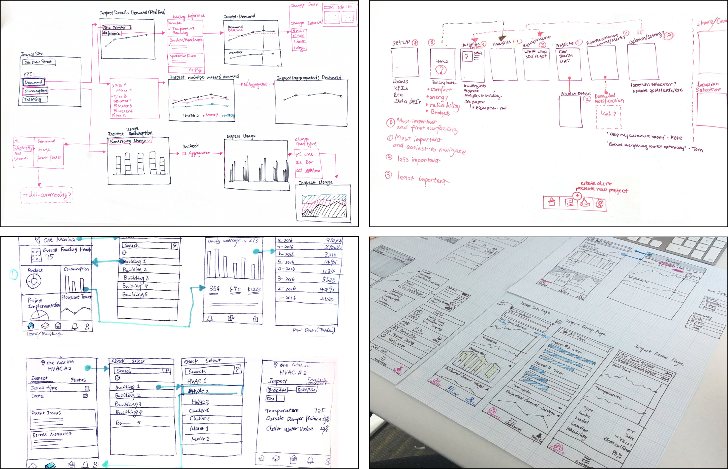
Early ideation sketches mapping out the app structure, key data views, and navigation patterns.
Process
Brainstorm and ideation
The product managers and I talked to energy analysts and customer success managers to learn what reports are most popular and what data is most useful to customers. We listened to past customer interviews and brainstormed product ideas around the core use cases that drove real decisions in the field.
Low-fidelity prototype used in the first round of remote testing with 6 customers.
First user testing: validate product hypotheses
Remote prototype testing with 6 customers to validate two key questions:
- Which categories of content and functionality are essential for an initial release (MVP)?
- How important is access to EIS on mobile? Does it matter if mobile is the only access?
Mobile is not only "OK" — it is the preferred platform for the targeted users. Tested users value real-time data visibility of meters and the measure management feature above all other functionality.
"Inspect" and "Project" pages were prioritized for the MVP, and renamed Overview and Measure based on how users described them.
Refined low-fidelity prototype for the second round — focused on the MVP feature set with narrowed scope.
Second user testing: narrow down to an MVP
Remote prototype testing with 5 customers to validate three key questions:
- Does the reduced set of functionality resonate with target users and help them with their core responsibilities?
- Do users notice any critical or valuable components missing from the MVP?
- Do users find the navigation mechanism intuitive and effective?
"Tom" (building operator) was largely satisfied with MVP functionality. "Emily" (energy manager) wanted desktop access to raw data so she could build spreadsheets to track performance against goals and report to management — validating the need for a future web app. 5 out of 5 users navigated correctly, though testing revealed that two levels of location selector were not optimal for interaction efficiency.
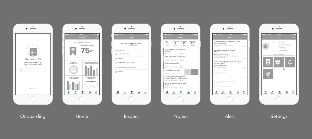
The mobile-first MVP: real-time building and meter data on the Overview page, and a Measure workflow tool for tracking implementation.
Final Design
Mobile-first MVP
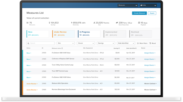
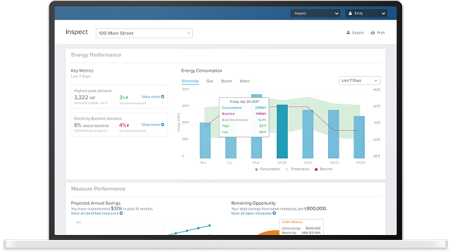
The final MVP focused on the two features users valued most: real-time data visibility across buildings and meters (Overview), and a workflow management tool for tracking energy measures (Measure).
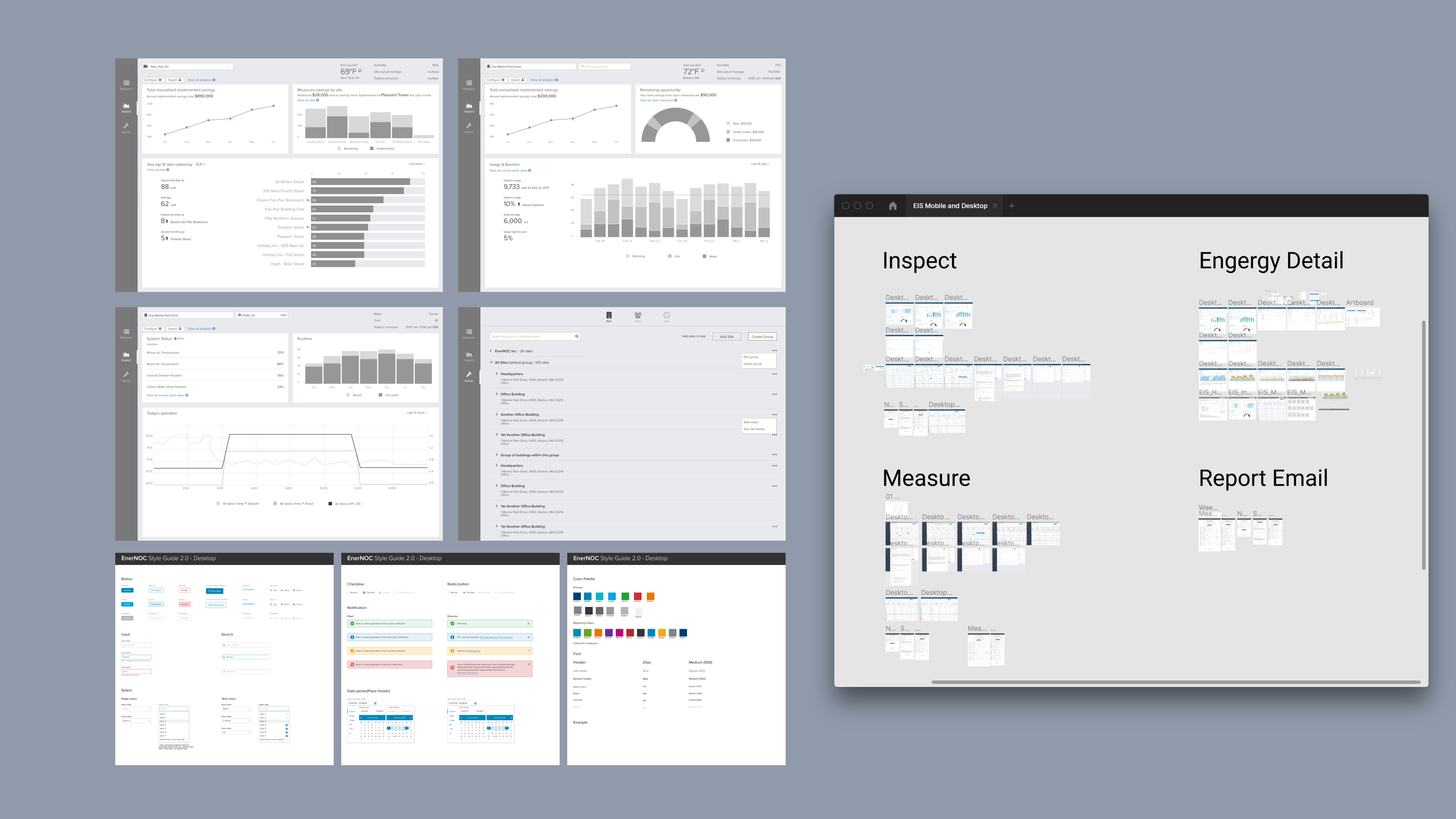
Site map for the responsive desktop web app — mirroring the mobile MVP's structure while enabling deeper data exploration.
Desktop web app
After delivering the mobile MVP, we designed and launched a responsive desktop web app with the same core functionality — providing the raw data access that power users like "Emily" needed for reporting and deeper analysis.
As part of this work, I also redesigned the UI style guide and published interactive patterns and components to encourage a unified design language and consistent look and feel across the product family.
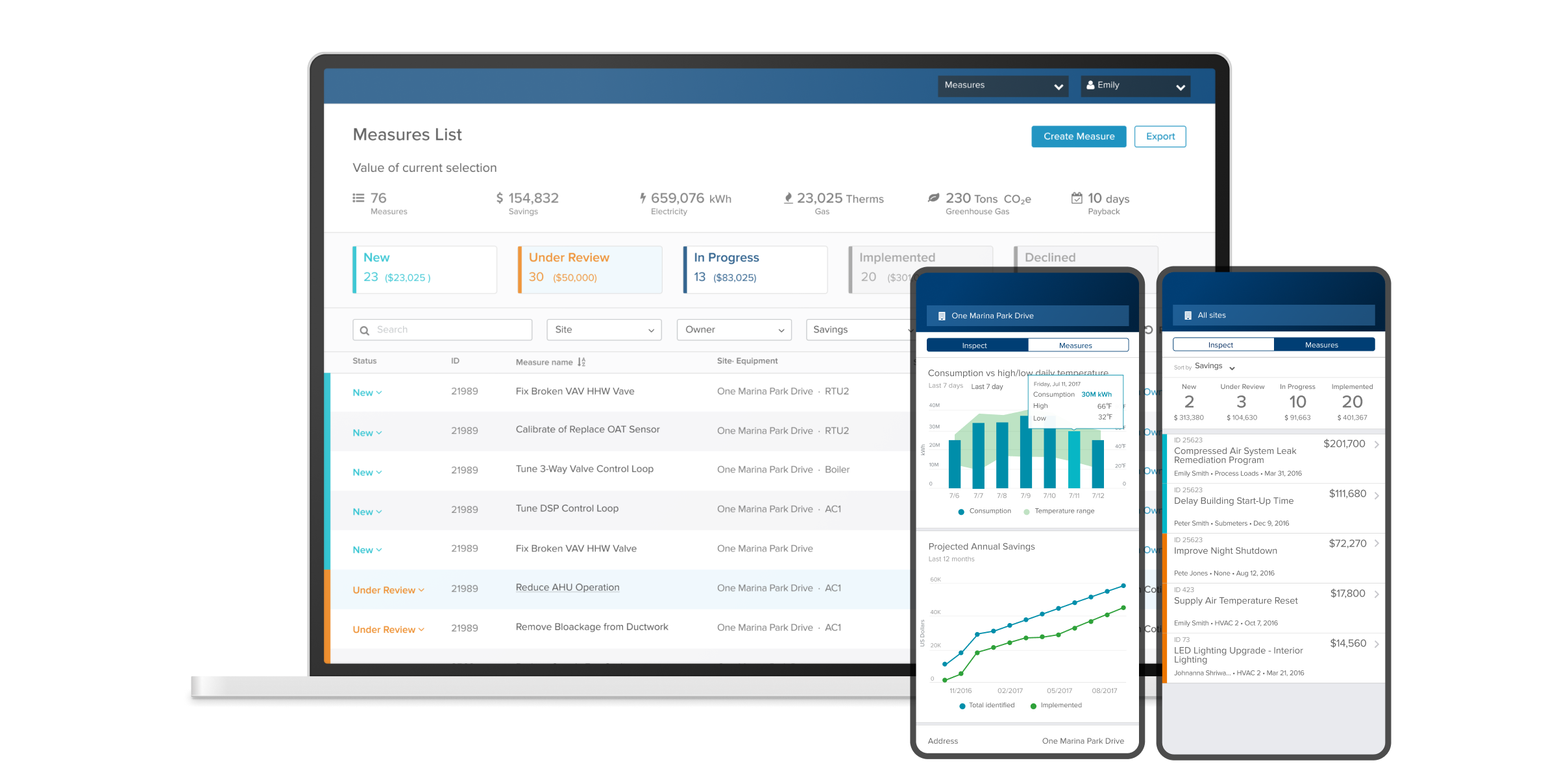
Overview page: live data across buildings and meters with aggregations and trend comparisons.
Measure page: workflow management for tracking energy measure implementation across the team.